Project:
MSD Health News
Client:
Merck
Responsibilities:
UI / UX / RWD Design / Development
Site:
Ready to start your next project?

Project:
MSD Health News
Client:
Merck
Responsibilities:
UI / UX / RWD Design / Development
Site:
01
The Task
We need a tool to share knowledge and make our products powerful.
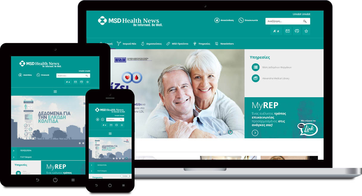
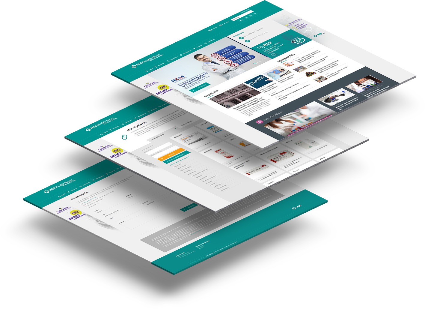
MSD Health News is not just another website, but also a platform to educate staff and clients via e-learning, to offer services like myRep for patients who need their own Health Medical Advisor. A platform to track newsletters, landing pages and promotions.

02
The Approach
Make it a tool. Offer services like never before. Educate your staff and clients. Make information easy.
Make it repeatable. Satisfy the eye. Enjoy the "stay" and visit us again and again. This project makes messages transparent and timeless.
Make it easy to navigate. Horizontal menu is the most intuitive approach to navigate throughout a website, everything is there, just a click away. Every page have simple actions, contact pages, products, news.
Make it easy to read. Our audience consists of regular users, so we require their minimum effort to enhance their experience.

03
The Result
MSD discovered new potentials. The ability to deliver information easy, to tackle any type of user. It has become a new platform to deliver e-learning, up to date medical information, newsletters, product landing pages and direct contact for their multi-channel activities.
The overall web experience dramatically increased user's involvement and satisfaction.